Form
Examples
Action buttons
Use the actions slot to provide form action buttons.
<template>
<article>
  <veui-form
    :data="formData"
    @submit="handleSubmit"
  >
    <veui-field label="型号">
      <veui-select
        v-model="formData.model"
        :options="models"
      />
    </veui-field>
    <veui-field label="日期">
      <veui-date-picker
        v-model="formData.date"
      />
    </veui-field>
    <template #actions>
      <veui-button
        ui="primary"
        type="submit"
      >
        提交
      </veui-button>
      <veui-button>取消</veui-button>
    </template>
  </veui-form>
</article>
</template>

<script>
import { Form, Field, Button, Select, DatePicker } from 'veui'

export default {
  components: {
    'veui-form': Form,
    'veui-field': Field,
    'veui-button': Button,
    'veui-select': Select,
    'veui-date-picker': DatePicker
  },
  data () {
    return {
      models: [
        {
          label: 'APTX-4867',
          value: 'aptx-4867'
        },
        {
          label: 'APTX-4868',
          value: 'aptx-4868'
        },
        {
          label: 'APTX-4869',
          value: 'aptx-4869'
        },
        {
          label: 'APTX-4870',
          value: 'aptx-4870'
        }
      ],
      formData: {
        model: null,
        date: null
      }
    }
  },
  methods: {
    handleSubmit (data) {
      this.$toast(JSON.stringify(data, null, 2))
    }
  }
}
</script>
Read-only
Set readonly to make the internal form items read-only.
<template>
<article>
  <section>
    <veui-checkbox v-model="readonly">
      只读
    </veui-checkbox>
  </section>
  <veui-form
    :data="formData"
    :readonly="readonly"
  >
    <veui-field label="姓名">
      <veui-input v-model="formData.name"/>
    </veui-field>
  </veui-form>
</article>
</template>

<script>
import { Form, Field, Input, Checkbox } from 'veui'

export default {
  components: {
    'veui-checkbox': Checkbox,
    'veui-form': Form,
    'veui-field': Field,
    'veui-input': Input
  },
  data () {
    return {
      readonly: true,
      formData: {
        name: ''
      }
    }
  }
}
</script>

<style lang="less" scoped>
section {
  margin-bottom: 20px;
}
</style>
Disabled
Set disabled to disable the internal form items.
<template>
<article>
  <section>
    <veui-checkbox v-model="disabled">
      禁用
    </veui-checkbox>
  </section>
  <veui-form
    :data="formData"
    :disabled="disabled"
  >
    <veui-field label="姓名">
      <veui-input v-model="formData.name"/>
    </veui-field>
  </veui-form>
</article>
</template>

<script>
import { Form, Field, Input, Checkbox } from 'veui'

export default {
  components: {
    'veui-checkbox': Checkbox,
    'veui-form': Form,
    'veui-field': Field,
    'veui-input': Input
  },
  data () {
    return {
      disabled: true,
      formData: {
        name: ''
      }
    }
  }
}
</script>

<style lang="less" scoped>
section {
  margin-bottom: 20px;
}
</style>
Help text
<template>
<article>
  <section>
    <span class="label-text">辅助信息位置:</span>
    <veui-radio-button-group
      v-model="helpPosition"
      ui="s"
      :items="helpPositions"
    />
    <veui-checkbox
      v-model="labelPosition"
      true-value="top"
      false-value="side"
      ui="s"
      style="margin-left: 8px"
    >
      上下布局
    </veui-checkbox>
  </section>
  <veui-form
    :data="formData"
    :label-position="labelPosition"
  >
    <veui-field
      name="name"
      label="姓名"
      tip="你的全名"
      help="至少 2 个字符"
      :help-position="helpPosition"
    >
      <veui-input v-model="formData.name"/>
    </veui-field>
    <veui-field
      name="address"
      label="地址"
      tip="居住地的详细地址"
      help="精确到门牌号"
      :help-position="helpPosition"
    >
      <veui-input v-model="formData.address"/>
    </veui-field>
  </veui-form>
</article>
</template>

<script>
import { Form, Field, Input, Checkbox, RadioButtonGroup } from 'veui'

export default {
  components: {
    'veui-form': Form,
    'veui-field': Field,
    'veui-input': Input,
    'veui-radio-button-group': RadioButtonGroup,
    'veui-checkbox': Checkbox
  },
  data () {
    return {
      formData: {
        name: '',
        address: ''
      },
      helpPositions: [
        { label: 'top', value: 'top' },
        { label: 'side', value: 'side' },
        { label: 'bottom', value: 'bottom' }
      ],
      helpPosition: 'side',
      labelPosition: 'side'
    }
  }
}
</script>

<style lang="less" scoped>
section {
  margin-bottom: 20px;
}

.label-text {
   font-size: 12px;
   margin-right: 8px;
 }
</style>
Rules
<template>
<article class="veui-form-demo">
  <veui-form
    ref="form"
    :data="data"
  >
    <veui-field
      field="phone"
      name="phone"
      :rules="phoneRule"
      label="手机"
    >
      <veui-input
        v-model="data.phone"
        name="phone"
        autocomplete="off"
      />
    </veui-field>

    <template #actions>
      <veui-button
        ui="primary"
        type="submit"
      >提交</veui-button>
    </template>
  </veui-form>
</article>
</template>

<script>
import {
  Form,
  Field,
  Input,
  Button
} from 'veui'

export default {
  name: 'demo-form',
  components: {
    'veui-input': Input,
    'veui-button': Button,
    'veui-form': Form,
    'veui-field': Field
  },
  data () {
    return {
      data: {
        phone: '1888888888a'
      },
      phoneRule: [
        {
          name: 'pattern',
          value: /^1\d{10}$/,
          message: '{value} 不是正确的手机号',
          triggers: 'blur'
        }
      ]
    }
  }
}
</script>
Inline rules
<template>
<article class="veui-form-demo">
  <veui-form
    ref="form"
    :data="data"
  >
    <veui-field
      label="密码"
      name="password"
      :rules="[
        { name: 'required', triggers: 'input,blur' },
        { name: 'minLength', value: '6', triggers: 'blur' }
      ]"
    >
      <veui-input
        v-model="data.password"
        type="password"
      />
    </veui-field>

    <veui-field
      label="确认密码"
      name="password2"
      :rules="p2Rules"
    >
      <veui-input
        v-model="data.password2"
        type="password"
      />
    </veui-field>
  </veui-form>
</article>
</template>

<script>
import {
  Form,
  Field,
  Input
} from 'veui'

export default {
  name: 'demo-form',
  components: {
    'veui-input': Input,
    'veui-form': Form,
    'veui-field': Field
  },
  data () {
    return {
      data: {
        password: '',
        password2: ''
      }
    }
  },
  computed: {
    p2Rules () {
      return [
        { name: 'required', triggers: 'input,blur' },
        {
          name: 'prefix',
          value: this.data.password,
          triggers: 'input',
          message: '两次输入的密码不一致',
          validate (val, ruleValue) {
            return (ruleValue || '').indexOf(val || '') === 0
          }
        },
        {
          name: 'same',
          value: this.data.password,
          triggers: 'change,password:input',
          message: '两次输入的密码不一致',
          validate (val, ruleValue) {
            return !val || (ruleValue || '') === val
          }
        }
      ]
    }
  }
}
</script>
Async validation
<template>
<article class="form-demo">
  <veui-form
    ref="form"
    :data="data"
    :validators="validators"
  >
    <veui-fieldset
      label="预期收入"
      class="salary"
      tip="下限必须小于上限"
      :required="true"
    >
      <veui-field
        field="start"
        name="start"
        :rules="numRequiredRule"
        class="start-field"
      >
        <veui-input
          v-model="data.start"
          class="input"
        />
      </veui-field>
      <veui-span style="margin: 0 4px">
        -
      </veui-span>
      <veui-field
        field="end"
        name="end"
        :rules="numRequiredRule"
      >
        <veui-input
          v-model="data.end"
          class="input"
        />
      </veui-field>
      <veui-span>万</veui-span>
    </veui-fieldset>

    <template #actions="{ validating }">
      <veui-button
        ui="primary"
        :loading="validating"
        type="submit"
      >
        提交
      </veui-button>
    </template>
  </veui-form>
</article>
</template>

<script>
import {
  Form,
  Fieldset,
  Field,
  Input,
  Button,
  Span
} from 'veui'

export default {
  name: 'demo-form',
  components: {
    'veui-span': Span,
    'veui-input': Input,
    'veui-button': Button,
    'veui-form': Form,
    'veui-field': Field,
    'veui-fieldset': Fieldset
  },
  data () {
    return {
      data: {
        start: 20000,
        end: 10000
      },
      numRequiredRule: [
        {
          name: 'numeric',
          value: true,
          triggers: 'blur,input'
        },
        {
          name: 'required',
          value: true,
          triggers: 'blur,input'
        }
      ],
      validators: [
        {
          fields: ['start', 'end'],
          handler (start, end) {
            if (start == null || end == null) {
              return true
            }

            return new Promise(function (resolve) {
              setTimeout(function () {
                let res = {}
                if (parseInt(start, 10) < 4000) {
                  res.start = {
                    status: 'warning',
                    message: '请提高下限'
                  }
                }
                if (parseInt(start, 10) >= parseInt(end, 10)) {
                  res.end = '上限必须大于下限'
                }
                resolve(Object.keys(res).length ? res : true)
              }, 2000)
            })
          },
          triggers: ['change', 'submit,input']
        }
      ]
    }
  }
}
</script>

<style lang="less" scoped>
.form-demo {
  .salary {
    .input {
      width: 80px;
    }
  }
}
</style>
Before/after validation
<template>
<article class="veui-form-demo">
  <veui-form
    ref="form"
    :data="data"
    :before-validate="beforeValidate"
    :after-validate="afterValidate"
  >
    <veui-field
      field="name"
      name="name"
      label="姓名"
    >
      <veui-input v-model="data.name"/>
    </veui-field>

    <veui-field
      field="phone"
      name="phone"
      label="手机"
    >
      <veui-input
        v-model="data.phone"
        name="phone"
        autocomplete="off"
      />
    </veui-field>

    <template #actions>
      <veui-button
        ui="primary"
        type="submit"
      >提交</veui-button>
    </template>
  </veui-form>
</article>
</template>

<script>
import {
  Form,
  Field,
  Input,
  Button
} from 'veui'
import confirmManager from 'veui/managers/confirm'

export default {
  name: 'demo-form',
  components: {
    'veui-input': Input,
    'veui-button': Button,
    'veui-form': Form,
    'veui-field': Field
  },
  data () {
    return {
      data: {
        name: '曹达华',
        phone: '18888888888'
      }
    }
  },
  methods: {
    beforeValidate () {
      return new Promise((resolve) => {
        confirmManager
          .warn('前置校验通过吗?', '确认', {
            ok: () => {}
          })
          .then((ok) => {
            resolve(ok)
          })
      })
    },
    afterValidate () {
      return new Promise((resolve) => {
        confirmManager
          .warn('后置校验通过吗?', '确认', {
            ok: () => {}
          })
          .then((ok) => {
            resolve(ok)
          })
      })
    }
  }
}
</script>
Abstract fields
<template>
<article>
  <veui-form
    :data="formData"
  >
    <veui-field
      label="门店"
      name="store"
      :rules="[{
        name: 'required', message: '请选择门店', triggers: 'select'
      }]"
    >
      <veui-transfer
        v-model="formData.store"
        :datasource="storeList"
      >
        <template #selected-item-label="{ label, value }">
          <div class="selected-store">
            <span class="store-label">{{ label }}</span>
            <veui-field
              :key="`storeCounts.${value}`"
              :name="`storeCounts.${value}`"
              :rules="[
                { name: 'required', message: `请填写${label}的数量`, triggers: 'change,blur' }
              ]"
              abstract
            >
              <veui-number-input
                v-model="formData.storeCounts[value]"
                class="store-number"
                ui="s"
                :min="1"
              />
            </veui-field>
          </div>
        </template>
      </veui-transfer>
    </veui-field>
  </veui-form>
</article>
</template>

<script>
import { Form, Field, NumberInput, Transfer } from 'veui'

export default {
  components: {
    'veui-form': Form,
    'veui-field': Field,
    'veui-number-input': NumberInput,
    'veui-transfer': Transfer
  },
  data () {
    return {
      disabled: true,
      formData: {
        store: [],
        storeCounts: {}
      },
      storeList: [
        { label: '门店1', value: '1' },
        { label: '门店2', value: '2' },
        { label: '门店3', value: '3' },
        { label: '门店4', value: '4' }
      ]
    }
  }
}
</script>

<style lang="less" scoped>
.selected-store {
  display: flex;
  align-items: center;

  .store-label {
    min-width: 60px;
  }
}
</style>
Native inputs
<template>
<article>
  <veui-form
    :data="formData"
  >
    <veui-field
      label="名称"
      name="name"
      withhold-validity
      :rules="[{ name: 'required', triggers: 'input,blur' }]"
    >
      <template #default="{ invalid, listeners }">
        <input
          v-model="formData.name"
          :class="{
            'demo-invalid': invalid
          }"
          v-on="listeners"
        >
      </template>
    </veui-field>
  </veui-form>
</article>
</template>

<script>
import { Form, Field } from 'veui'

export default {
  components: {
    'veui-form': Form,
    'veui-field': Field
  },
  data () {
    return {
      formData: {
        name: ''
      }
    }
  }
}
</script>

<style lang="less" scoped>
.demo-invalid {
  border: 1px solid #cc1800;
}
</style>
API
Props
| Name | Type | Default | Description | ||||||||||||||||||||||||||||||
|---|---|---|---|---|---|---|---|---|---|---|---|---|---|---|---|---|---|---|---|---|---|---|---|---|---|---|---|---|---|---|---|---|---|
readonly | boolean | false | Whether the internal input component is in read-only state. | ||||||||||||||||||||||||||||||
disabled | boolean | false | Whether the internal input component is disabled. | ||||||||||||||||||||||||||||||
data | Object | - | Data bound to the form, bound to input components in the form through | ||||||||||||||||||||||||||||||
validators | Array<Object> | - | Cross validators and async validator. The item type is
| ||||||||||||||||||||||||||||||
before-validate | function | - | Hook before the form enters the validation process, with parameters (data), which is a copy of the form data property value. Supports returning Promise, true or undefined for the return value or Promise.resolve indicates that the process continues, and other return values indicate interrupting the process and triggering the invalid event. | ||||||||||||||||||||||||||||||
after-validate | function | - | Hook triggered after the form is successfully validated and before the submit event is triggered, with parameters (data), which is the same reference as the entry parameter in beforeValidate. Supports returning Promise, true or undefined for the return value or Promise.resolve indicates that the process continues, and other return values indicate interrupting the process and triggering the invalid event. |
Slots
| Name | Description | |||||||||
|---|---|---|---|---|---|---|---|---|---|---|
default | Can be directly inlined with
| |||||||||
actions | Form operation content, such as "Submit" and "Cancel" buttons. There is no default content. The slot parameter is the same as the default slot. |
Events
| Name | Description | |||||||||
|---|---|---|---|---|---|---|---|---|---|---|
submit | Triggered after the native
| |||||||||
invalid | Triggered when a process in the |
Methods
| Name | Description |
|---|---|
submit | Manually submit the form. |
validate | Manually validate the form. Optional parameter Returns a |
clearValidities | Manually clear the validation messages. Optional parameter |
setValidities | Manually set the validation messages. |
Form submission
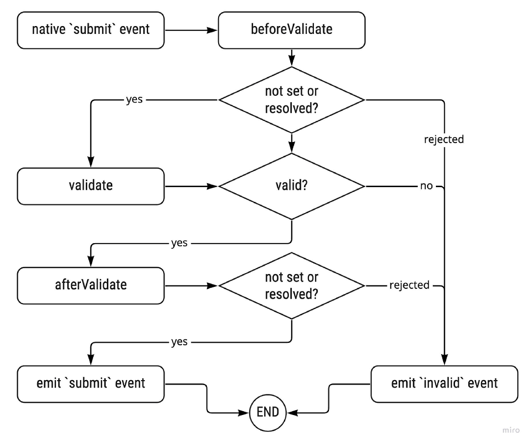
Form validation
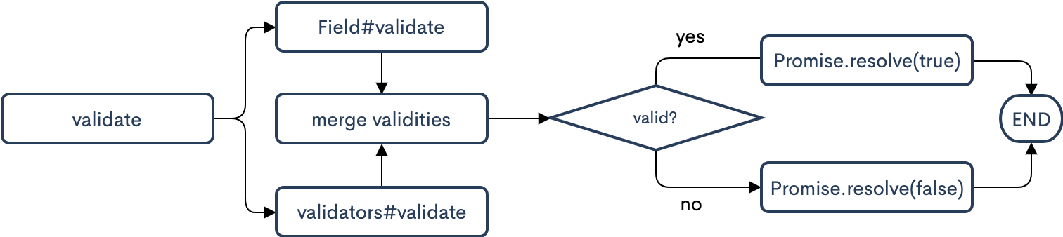
The form validation is divided into the rule validation of the Field and the validation of the validators.
- The
ruleof theFieldis a single-value synchronous validation. See form item for details. - The
validatorscan be multi-value asynchronous validation.
validators: [
  {
    fields: ['start', 'end'],
    validate (start, end) {
      if (start == null || end == null) {
        return true
      }

      if (parseInt(start, 10) >= parseInt(end, 10)) {
        return {
          start: 'The lower limit must be less than the upper limit'
        }
      }
      return true
    },
    triggers: ['change', 'submit,input']
  },
  {
    fields: ['phone'],
    validate (phone) {
      return new Promise(function (resolve) {
        setTimeout(function () {
          let res
          if (phone === '18888888888') {
            res = {
              phone: 'This phone has been registered'
            }
          }
          return resolve(res)
        }, 3000)
      })
    },
    triggers: ['input']
  }
]
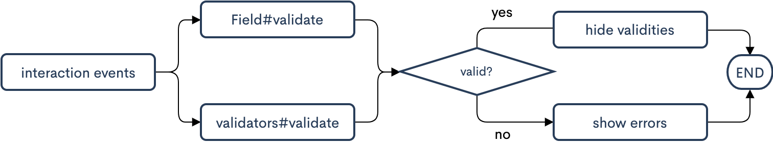
Interaction validation
Submission validation
During submission, the failure of one of the validation processes will not cause the entire validation to terminate. The validation information will be integrated after both processes are completed and passed to the invalid event.