Empty
Examples
Default
No data
<template>
<article>
  <veui-empty/>
</article>
</template>

<script>
import { Empty } from 'veui'

export default {
  components: {
    'veui-empty': Empty
  }
}
</script>

<style scoped>
article {
  display: flex;
  flex-direction: column;
  align-items: center;
}
</style>
Hero
IllustrationForbidden
没有权限
请联系管理员为你添加权限
<template>
<article>
  <section>
    <veui-select
      v-model="current"
      class="picker"
      ui="s"
      :options="options"
      overlay-style="--dls-dropdown-max-display-items: 4;"
    />
  </section>
  <veui-empty
    title="没有权限"
  >
    <component :is="illustrations[current]"/>
    <template #desc>
      请联系管理员为你添加权限
      <veui-button ui="strong text">
        发送邮件
      </veui-button>
    </template>
    <template #actions>
      <veui-button ui="primary">
        回到首页
      </veui-button>
    </template>
  </veui-empty>
</article>
</template>

<script>
import { Empty, Button, Select } from 'veui'
import * as illustrations from 'dls-illustrations-vue'

const illustrationNames = [
  'IllustrationBlank',
  'IllustrationClientError',
  'IllustrationForbidden',
  'IllustrationNoResults',
  'IllustrationNotFound',
  'IllustrationReviewError',
  'IllustrationReviewPending',
  'IllustrationReviewSuccess',
  'IllustrationServerError'
]

export default {
  components: {
    'veui-empty': Empty,
    'veui-button': Button,
    'veui-select': Select
  },
  data () {
    return {
      illustrations,
      current: 'IllustrationForbidden'
    }
  },
  computed: {
    options () {
      return illustrationNames.map(name => ({
        label: name,
        value: name
      }))
    }
  }
}
</script>

<style scoped>
article {
  display: flex;
  flex-direction: column;
  align-items: center;
  gap: 30px;
}

section {
  align-self: flex-start;
}

.picker {
  width: 240px;
}
</style>
Spot
IllustrationSpotLoadError
服务器错误
<template>
<article>
  <section>
    <veui-select
      v-model="current"
      class="picker"
      ui="s"
      :options="options"
      overlay-style="--dls-dropdown-max-display-items: 4;"
    />
    <veui-radio-button-group
      v-model="size"
      ui="s"
      :items="sizes"
    />
  </section>
  <veui-empty
    :ui="size"
    desc="服务器错误"
  >
    <component :is="illustrations[current]"/>
  </veui-empty>
</article>
</template>

<script>
import { Empty, Button, Select, RadioButtonGroup } from 'veui'
import * as illustrations from 'dls-illustrations-vue'

const illustrationNames = [
  'IllustrationSpotBarChart',
  'IllustrationSpotCleared',
  'IllustrationSpotFunnelChart',
  'IllustrationSpotGaugeChart',
  'IllustrationSpotImageError',
  'IllustrationSpotLineChart',
  'IllustrationSpotLoadError',
  'IllustrationSpotMap',
  'IllustrationSpotNetworkError',
  'IllustrationSpotNoAccess',
  'IllustrationSpotNoContent',
  'IllustrationSpotNoFavorites',
  'IllustrationSpotNoHistory',
  'IllustrationSpotNoImage',
  'IllustrationSpotNoInternet',
  'IllustrationSpotNoMessages',
  'IllustrationSpotNoResults',
  'IllustrationSpotNoStore',
  'IllustrationSpotNoVideo',
  'IllustrationSpotPieChart',
  'IllustrationSpotPresentation',
  'IllustrationSpotRadarChart',
  'IllustrationSpotRelationshipChart',
  'IllustrationSpotServerError',
  'IllustrationSpotTryLater',
  'IllustrationSpotVideoError',
  'IllustrationSpotWordCloud'
]

export default {
  components: {
    'veui-empty': Empty,
    'veui-button': Button,
    'veui-select': Select,
    'veui-radio-button-group': RadioButtonGroup
  },
  data () {
    return {
      illustrations,
      current: 'IllustrationSpotLoadError',
      sizes: [
        {
          label: 'm',
          value: 'm'
        }, {
          label: 's',
          value: 's'
        }
      ],
      size: 'm'
    }
  },
  computed: {
    options () {
      return illustrationNames.map(name => ({
        label: name,
        value: name
      }))
    }
  }
}
</script>

<style scoped>
article {
  display: flex;
  flex-direction: column;
  align-items: center;
  gap: 30px;
}

section {
  display: flex;
  gap: 12px;
  align-self: flex-start;
}

.picker {
  width: 240px;
}
</style>
Custom
内置 <img> 标签
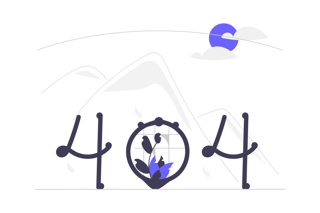
找不到对应的内容
请检查输入的网址是否正确
任意内容
未知错误
<template>
<article>
<section>
<h4>内置 <code><img></code> 标签</h4>
<veui-empty
:image="image"
title="找不到对应的内容"
desc="请检查输入的网址是否正确"
/>
</section>
<section>
<h4>任意内容</h4>
<veui-empty
ui="s"
title="未知错误"
:desc="false"
>
<veui-icon
name="exclamation-circle-solid"
style="height: 96px; color: rebeccapurple;"
/>
</veui-empty>
</section>
</article>
</template>
<script>
import { Empty, Icon } from 'veui'
import 'veui-theme-dls-icons/exclamation-circle-solid'
export default {
components: {
'veui-empty': Empty,
'veui-icon': Icon
},
data () {
return {
image: {
src: 'http://ecma.bdimg.com/public01/one-design/597ed72aff7a9fbacf23ba79b43aa61d.png',
width: 296,
height: 197,
alt: '404 illustration provided by unDraw'
}
}
}
}
</script>
<style lang="less" scoped>
section {
display: flex;
flex-direction: column;
align-items: center;
& + & {
margin-top: 20px;
}
}
h4 {
align-self: flex-start;
}
</style>
API
Props
| Name | Type | Default | Description | ||||||
|---|---|---|---|---|---|---|---|---|---|
ui | string | - | Predefined styles.
| ||||||
image | Object | false | - | Configuration for the illustration content. If not passed, the default illustration will be displayed. If passed as an Object, the fields will be output as attributes of the <img> element. If passed as false, the illustration will be hidden. If the default slot has content, this prop will be ignored. | ||||||
title | string | - | Title of the empty state. | ||||||
desc | string | false | - | Description of the empty state. If passed as false, the description will be hidden. |
Slots
| Name | Description |
|---|---|
default | Illustration content. By default, the illustration corresponding to "No Data" will be displayed. |
title | Title area. |
desc | Description area. |
actions | Action area. |