Overlay Management
In VEUI, a large number of components use overlay functionality:
For these components, we extracted the overlay module with the following features:
- It can float above all ordinary elements on the page.
- It can manage the stacking order.
- It can be positioned based on the specified element.
Stacking order
To avoid the overlay being accidentally covered by an upper overflow: hidden element, we place the root element of the overlay directly under the <body> for unified management.
In the Overlay component, .veui-overlay-box corresponds to the root element of the overlay, which is placed under the <body> when the component is initialized and removed when the component is destroyed.
Stacking order management
After placing the root element of the overlay under the <body>, the original hierarchy nesting relationship is lost, and the overlay stacking order cannot be controlled through the native stacking context mechanism. For example:
- If a dialog component A has a select component B, the B component overlay should be above the A component overlay.
- The alert box overlay should be above the normal dialog box overlay.
Based on the above limitations, the overlay module implements its own stacking order management mechanism. The entire overlay hierarchy is expressed through a tree:
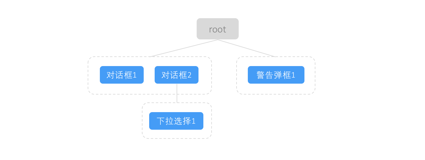
Each blue node in the tree corresponds to a specific Overlay component instance. For the above figure, the construction order of the tree can be:
- Pop up "Dialog 1", create a "Dialog 1" node, create a group according to the node weight information, and then hang the group under the root node.
- Pop up "Dialog 2", create a "Dialog 2" node, find that there is an existing group with the same weight, and directly place the "Dialog 2" node at the end of the group.
- Instantiate a "Select 1" component instance in "Dialog 2". Since the "Dialog 2" component instance is the parent of the "Select 1" component instance, the corresponding overlay node should also have a parent-child relationship, so a group and a "Select 1" node are generated under the "Dialog 2" node in a similar manner to "Step 1".
- At this time, due to a program failure, "Alert box 1" is popped up. Since the "Alert box" type component has a higher level of weight than the "Dialog" component, a new right-aligned group is created under the root, and the generated "Alert box 1" node is placed at the end of the group.
With the tree, the z-index value of each node will be generated according to the depth-first traversal order.
Among them, the base z-index value can be configured through the global configuration object:
import config from 'veui/managers/config'

config.set('overlay.baseZIndex', 200)
The stacking priority can be set for component types or even component instance granularity. The larger the stacking priority value, the larger the z-index value generated in the end. Component instances at the same level with the same stacking priority, the later the instantiated component, the larger the z-index value generated.
The Overlay component, Dialog component, and pop-up component provide the priority prop for customizing the stacking priority of component instances:
<veui-dialog :priority="300"/>
Some special components provide configuration of stacking priority based on component type granularity:
| Component | Config field | Default | Example |
|---|---|---|---|
| Alert box | alertbox.priority | 100 | |
| Confirm box | confirmbox.priority | 100 | |
| Prompt box | promptbox.priority | 100 | |
In summary, the logic flow of determining the stacking priority of a overlay component instance is:
- If the stacking priority of the component instance level can be set and is set, use this stacking priority value, otherwise proceed to the next step;
- If the stacking priority of the component type level can be set and is set, use this stacking priority value, otherwise proceed to the next step;
- Use the default stacking priority value:
1.
Positioning
In VEUI, overlays support two positioning modes:
- Positioning based on coordinate values within the page scope;
- Positioning relative to an element, with offset and transformation rules specified.
When positioning based on coordinates, you need to write CSS to control it (the overlay module only generates the z-index value of the overlay root element internally).
When positioning relative to an element, you can describe the offset and transformation rules through the options property of the overlay component. Since Popper.js is currently used internally for implementation, the complete configuration options can be found on the Popper.js official website.
Style Variants
Because the root element of the overlay is manually placed under the <body> element, to set the style of the overlay content, you need to specify a class for the overlay root element. All overlay components support the overlay-class prop, which sets the class for the overlay root element:
<template>
  <veui-dialog overlay-class="my-dialog-overlay"/>
<template>

<style>
.my-dialg-overlay {
  /* Custom overlay style */
}
</style>