Carousel 轮播
示例
切换
使用 index 来控制当前显示的项目。
Index

当前是第 1 页,共 3 页
<template>
<article>
<section>
<h4>Index</h4>
<veui-number-input
v-model="index"
:min="0"
:max="items.length - 1"
/>
</section>
<section>
<veui-carousel
:datasource="items"
:index.sync="index"
/>
</section>
</article>
</template>
<script>
import { Carousel, NumberInput } from 'veui'
export default {
components: {
'veui-carousel': Carousel,
'veui-number-input': NumberInput
},
data () {
return {
items: [
{
src:
'https://ecmb.bdimg.com/public01/one-design/2b77cc4a4c5c906993c0e512f3ddaf03.jpg',
alt: 'A cute kitty looking at you with its greenish eyes.',
label: 'Cat'
},
{
src:
'https://ecmb.bdimg.com/public01/one-design/6fedc62b9221846ce5114c7447622e47.jpeg',
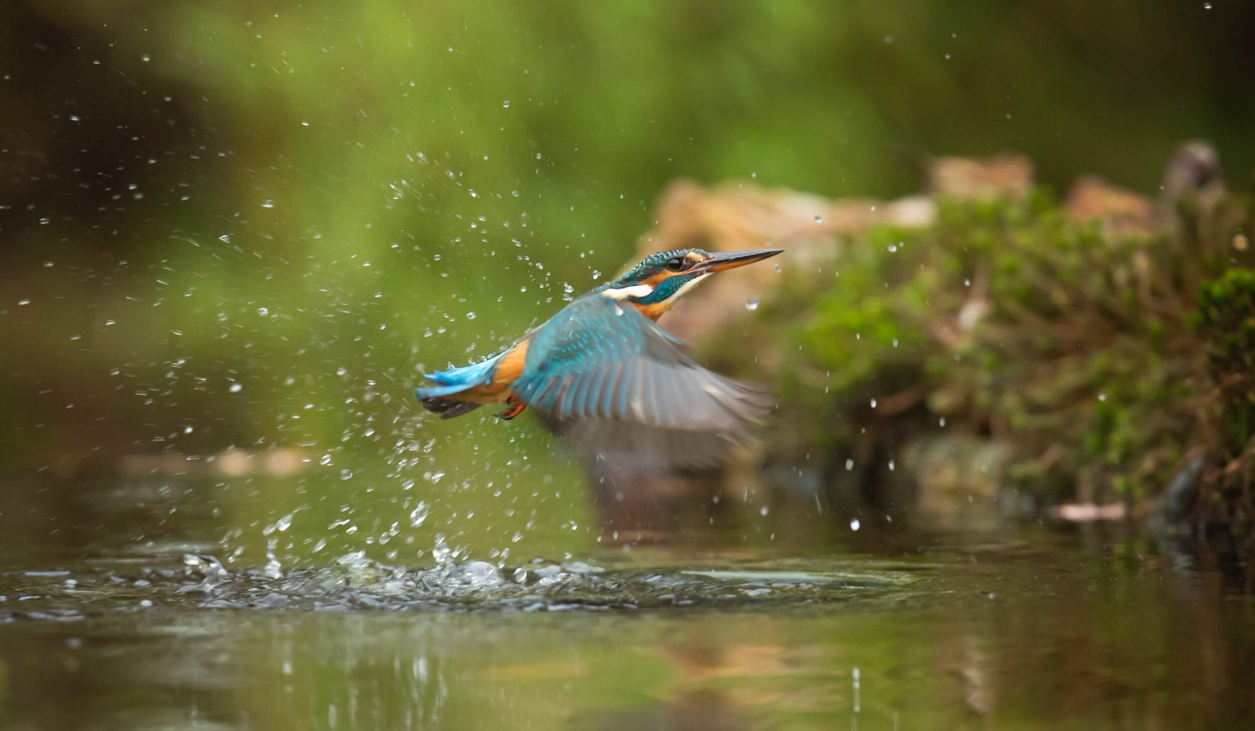
alt: 'A common kingfisher flying above river.',
label: 'Kingfisher'
},
{
src:
'https://ecmb.bdimg.com/public01/one-design/e1b6473c898d9e456452ee79d7533a86.jpeg',
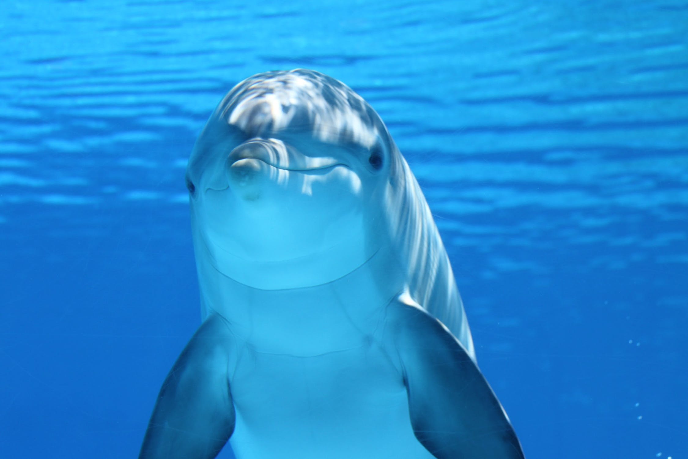
alt: 'A white and gray dolphin in blue water.',
label: 'Dolphin'
}
],
index: 0
}
}
}
</script>
<style lang="less" scoped>
h4 {
margin: 0 0 10px;
}
section {
margin-bottom: 10px;
}
</style>
进度指示器
使用 indicator 属性来指定进度指示器类型。
Indicator type
Indicator position(仅在对齐方式是 end 时生效)
Indicator align
当前是第 1 页,共 3 页
<template>
<article>
  <section>
    <h4>Indicator type</h4>
    <veui-radio-group
      v-model="indicator"
      :items="indicators"
    />
    <h4>Indicator position(仅在对齐方式是 end 时生效)</h4>
    <veui-radio-group
      v-model="indicatorPosition"
      :items="positions"
    />
    <h4>Indicator align</h4>
    <veui-radio-group
      v-model="align"
      :items="alignments"
    />
  </section>
  <section>
    <veui-carousel
      :datasource="items"
      :indicator="indicator"
      :indicator-position="indicatorPosition"
      :indicator-align="align"
    />
  </section>
</article>
</template>

<script>
import { Carousel, RadioGroup } from 'veui'

export default {
  components: {
    'veui-carousel': Carousel,
    'veui-radio-group': RadioGroup
  },
  data () {
    return {
      items: [
        {
          src:
            'https://ecmb.bdimg.com/public01/one-design/2b77cc4a4c5c906993c0e512f3ddaf03.jpg',
          alt: 'A cute kitty looking at you with its greenish eyes.',
          label: 'Cat'
        },
        {
          src:
            'https://ecmb.bdimg.com/public01/one-design/6fedc62b9221846ce5114c7447622e47.jpeg',
          alt: 'A common kingfisher flying above river.',
          label: 'Kingfisher'
        },
        {
          src:
            'https://ecmb.bdimg.com/public01/one-design/e1b6473c898d9e456452ee79d7533a86.jpeg',
          alt: 'A white and gray dolphin in blue water.',
          label: 'Dolphin'
        }
      ],
      indicator: 'bar',
      indicatorPosition: 'inside',
      align: 'start',
      indicators: [
        { label: 'bar', value: 'bar' },
        { label: 'number', value: 'number' },
        { label: 'dot', value: 'dot' },
        { label: 'none', value: 'none' }
      ],
      alignments: [
        { label: 'start', value: 'start' },
        { label: 'end', value: 'end' }
      ],
      positions: [
        { label: 'inside', value: 'inside' },
        { label: 'outside', value: 'outside' }
      ]
    }
  }
}
</script>

<style lang="less" scoped>
h4 {
  margin: 0 0 10px;

  &:not(:first-child) {
    margin-top: 10px;
  }
}

section {
  margin-bottom: 10px;
}
</style>
自动切换
指定 autoplay 属性来允许自动播放。
当前是第 1 页,共 3 页
还可以使用 interval 属性来指定自动播放的切换间隔时长,使用 wrap 属性来允许循环播放,以及使用 pause-on-hover 属性来时光标悬浮在指示器对应项时暂停自动播放。
<template>
<article>
  <veui-carousel
    :datasource="items"
    autoplay
    pause-on-hover
    :interval="5000"
  />
</article>
</template>

<script>
import { Carousel } from 'veui'

export default {
  components: {
    'veui-carousel': Carousel
  },
  data () {
    return {
      items: [
        {
          src:
            'https://ecmb.bdimg.com/public01/one-design/2b77cc4a4c5c906993c0e512f3ddaf03.jpg',
          alt: 'A cute kitty looking at you with its greenish eyes.',
          label: 'Cat'
        },
        {
          src:
            'https://ecmb.bdimg.com/public01/one-design/6fedc62b9221846ce5114c7447622e47.jpeg',
          alt: 'A common kingfisher flying above river.',
          label: 'Kingfisher'
        },
        {
          src:
            'https://ecmb.bdimg.com/public01/one-design/e1b6473c898d9e456452ee79d7533a86.jpeg',
          alt: 'A white and gray dolphin in blue water.',
          label: 'Dolphin'
        }
      ],
      autoplay: true,
      pauseOnHover: true
    }
  }
}
</script>
切换效果
指定 effect 属性来设置切换效果。
Effect type
当前是第 1 页,共 3 页
<template>
<article>
  <section>
    <h4>Effect type</h4>
    <veui-radio-group
      v-model="effect"
      :items="effects"
    />
  </section>
  <section>
    <veui-carousel
      :datasource="items"
      :effect="effect"
    />
  </section>
</article>
</template>

<script>
import { Carousel, RadioGroup } from 'veui'

export default {
  components: {
    'veui-carousel': Carousel,
    'veui-radio-group': RadioGroup
  },
  data () {
    return {
      items: [
        {
          src:
            'https://ecmb.bdimg.com/public01/one-design/2b77cc4a4c5c906993c0e512f3ddaf03.jpg',
          alt: 'A cute kitty looking at you with its greenish eyes.',
          label: 'Cat'
        },
        {
          src:
            'https://ecmb.bdimg.com/public01/one-design/6fedc62b9221846ce5114c7447622e47.jpeg',
          alt: 'A common kingfisher flying above river.',
          label: 'Kingfisher'
        },
        {
          src:
            'https://ecmb.bdimg.com/public01/one-design/e1b6473c898d9e456452ee79d7533a86.jpeg',
          alt: 'A white and gray dolphin in blue water.',
          label: 'Dolphin'
        }
      ],
      effect: 'fade',
      effects: [
        { label: 'Fade', value: 'fade' },
        { label: 'Slide', value: 'slide' }
      ]
    }
  }
}
</script>

<style lang="less" scoped>
h4 {
  margin: 0 0 10px;
}

section {
  margin-bottom: 10px;
}
</style>
纵向布局
指定 vertical 属性来允许纵向布局的轮播。
使用 controls-position 属性来切换按钮相对于布局方向的位置。
Controls position
当前是第 1 页,共 3 页
<template>
<article>
  <section>
    <h4>Controls position</h4>
    <veui-radio-group
      v-model="position"
      :items="positions"
    />
  </section>
  <section>
    <veui-carousel
      :datasource="items"
      effect="slide"
      :controls-position="position"
      vertical
    />
  </section>
</article>
</template>

<script>
import { Carousel, RadioGroup } from 'veui'

export default {
  components: {
    'veui-carousel': Carousel,
    'veui-radio-group': RadioGroup
  },
  data () {
    return {
      items: [
        {
          src:
            'https://ecmb.bdimg.com/public01/one-design/2b77cc4a4c5c906993c0e512f3ddaf03.jpg',
          alt: 'A cute kitty looking at you with its greenish eyes.',
          label: 'Cat'
        },
        {
          src:
            'https://ecmb.bdimg.com/public01/one-design/6fedc62b9221846ce5114c7447622e47.jpeg',
          alt: 'A common kingfisher flying above river.',
          label: 'Kingfisher'
        },
        {
          src:
            'https://ecmb.bdimg.com/public01/one-design/e1b6473c898d9e456452ee79d7533a86.jpeg',
          alt: 'A white and gray dolphin in blue water.',
          label: 'Dolphin'
        }
      ],
      position: 'inside',
      positions: [
        { label: 'Inside', value: 'inside' },
        { label: 'Outside', value: 'outside' }
      ]
    }
  }
}
</script>

<style lang="less" scoped>
h4 {
  margin: 0 0 10px;
}

section {
  margin-bottom: 10px;
}
</style>
轮播项设置
slides-per-view 属性来指定同时显示多少个轮播项。
slides-per-group 属性来指定每次前后切换的一组包含多少个轮播项。
2 view, 2 group

当前是第 1 页,共 4 页
2 view, 1 group
当前是第 1 页,共 4 页
<template>
<article>
  <section>
    <h4>2 view, 2 group</h4>
    <veui-carousel
      :datasource="items"
      :slides-per-group="2"
      :slides-per-view="2"
      effect="slide"
      indicator-position="outside"
      indicator-align="end"
      wrap
    />
    <h4>2 view, 1 group</h4>
    <veui-carousel
      :datasource="items"
      :slides-per-group="1"
      :slides-per-view="2"
      effect="slide"
      indicator-position="outside"
      indicator-align="end"
      wrap
    />
  </section>
</article>
</template>

<script>
import { Carousel } from 'veui'

export default {
  components: {
    'veui-carousel': Carousel
  },
  data () {
    return {
      items: [
        {
          src:
            'https://ecmb.bdimg.com/public01/one-design/2b77cc4a4c5c906993c0e512f3ddaf03.jpg',
          alt: 'A cute kitty looking at you with its greenish eyes.',
          label: 'Cat'
        },
        {
          src:
            'https://ecmb.bdimg.com/public01/one-design/6fedc62b9221846ce5114c7447622e47.jpeg',
          alt: 'A common kingfisher flying above river.',
          label: 'Kingfisher'
        },
        {
          src:
            'https://ecmb.bdimg.com/public01/one-design/e1b6473c898d9e456452ee79d7533a86.jpeg',
          alt: 'A white and gray dolphin in blue water.',
          label: 'Dolphin'
        },
        {
          src:
            'https://ss3.bdstatic.com/yrwDcj7w0QhBkMak8IuT_XF5ehU5bvGh7c50/logopic/1b61ee88fdb4a4b918816ae1cfd84af1_fullsize.jpg',
          alt: 'Tesla logo.',
          label: '特斯拉'
        }
      ]
    }
  }
}
</script>

<style lang="less" scoped>
h4 {
  margin: 0 0 10px;
}

section {
  margin-bottom: 10px;
}
</style>
轮播项纵横比
设置 slide-aspect-ratio 属性来指定每个轮播项的纵横比。
按 `2/1` 比例展示轮播项
当前是第 1 页,共 3 页
<template>
<article>
  <section>
    <h4>按 `2/1` 比例展示轮播项</h4>
    <veui-carousel
      :datasource="items"
      effect="slide"
      indicator-align="end"
      slide-aspect-ratio="2/1"
    />
  </section>
</article>
</template>

<script>
import { Carousel } from 'veui'

export default {
  components: {
    'veui-carousel': Carousel
  },
  data () {
    return {
      items: [
        {
          src:
            'https://ecmb.bdimg.com/public01/one-design/2b77cc4a4c5c906993c0e512f3ddaf03.jpg',
          alt: 'A cute kitty looking at you with its greenish eyes.',
          label: 'Cat'
        },
        {
          src:
            'https://ecmb.bdimg.com/public01/one-design/6fedc62b9221846ce5114c7447622e47.jpeg',
          alt: 'A common kingfisher flying above river.',
          label: 'Kingfisher'
        },
        {
          src:
            'https://ecmb.bdimg.com/public01/one-design/e1b6473c898d9e456452ee79d7533a86.jpeg',
          alt: 'A white and gray dolphin in blue water.',
          label: 'Dolphin'
        }
      ]
    }
  }
}
</script>

<style lang="less" scoped>
h4 {
  margin: 0 0 10px;
}

section {
  margin-bottom: 10px;
}
</style>
API
属性
| 名称 | 类型 | 默认值 | 描述 | |||||||||||||||
|---|---|---|---|---|---|---|---|---|---|---|---|---|---|---|---|---|---|---|
datasource | Array<Object> | [] | 轮播图数据源,项目类型为:
| |||||||||||||||
index | number | 0 |
当前轮播图序号。 | |||||||||||||||
indicator | string | 'radio' | 播放进度指示器的显示模式。
| |||||||||||||||
switch-trigger | string | 'click' | 当显示单选型指示器时,触发切换的操作。
| |||||||||||||||
autoplay | boolean | false | 是否自动轮播。 | |||||||||||||||
pause-on-hover | boolean | false | 在自动轮播时,鼠标悬浮后是否暂停。 | |||||||||||||||
interval | number | 3000 | 在自动轮播时,切换间隔的毫秒数。 | |||||||||||||||
wrap | boolean | false | 是否可以循环播放。 | |||||||||||||||
effect | 'fade' | 'slide' | 'fade' | 指定轮播切换效果,其中 fade 仅在切换组个数与同时显示个数相同时生效。 | |||||||||||||||
vertical | boolean | false | 是否是纵向布局的轮播。 | |||||||||||||||
indicator-align | 'start' | 'end' | start | 用于支持指示器的相对于布局方向的位置。 | |||||||||||||||
indicator-position | 'outside' | 'inside' | inside | 用于支持指示器显示在轮播容器的内部/外部。 | |||||||||||||||
controls | boolean | false | 是否显示切换按钮。 | |||||||||||||||
controls-position | 'outside' | 'inside' | inside | 用于支持切换按钮相对于布局方向的位置。 | |||||||||||||||
slide-aspect-ratio | number= | '${number}/${number}' | - | 指定不同轮播项类型的默认配置。 | |||||||||||||||
options | Object | { video: { muted: true, autoplay: true, controls: true, loop: true } } | 用于指定每个轮播项的纵横比。 | |||||||||||||||
slides-per-view | number | 1 | 指定同时显示多少个轮播项。 | |||||||||||||||
slides-per-group | number | 1 | 指定每次前后切换的一组包含多少个轮播项。 | |||||||||||||||
lazy | boolean= | { preload: number } | false | 指定是否懒加载轮播资源。
|
插槽
| 名称 | 描述 |
|---|---|
item | 可用来定制每个轮播项的区域。 默认内容:轮播项图片。 插槽参数为 |
事件
| 名称 | 描述 |
|---|---|
change | 切换后触发,回调参数为 |
图标
| 名称 | 描述 |
|---|---|
prev | 上一页。 |
next | 下一页。 |
自定义样式
| 名称 | 类型 | 默认值 | 描述 |
|---|---|---|---|
--dls-carousel-transition-duration | <time> | 0.2s | 轮播项切换动画的持续时长。 |
--dls-carousel-slide-gutter | <length> | 0 | 同时显示多个轮播项时轮播项之间的间隔。 |